Why a Public Square Feels Different from a Street
Learn how enclosure, movement, and invitation make a public square feel distinct from a street, so you can notice whether its layout welcomes lingering or passage.
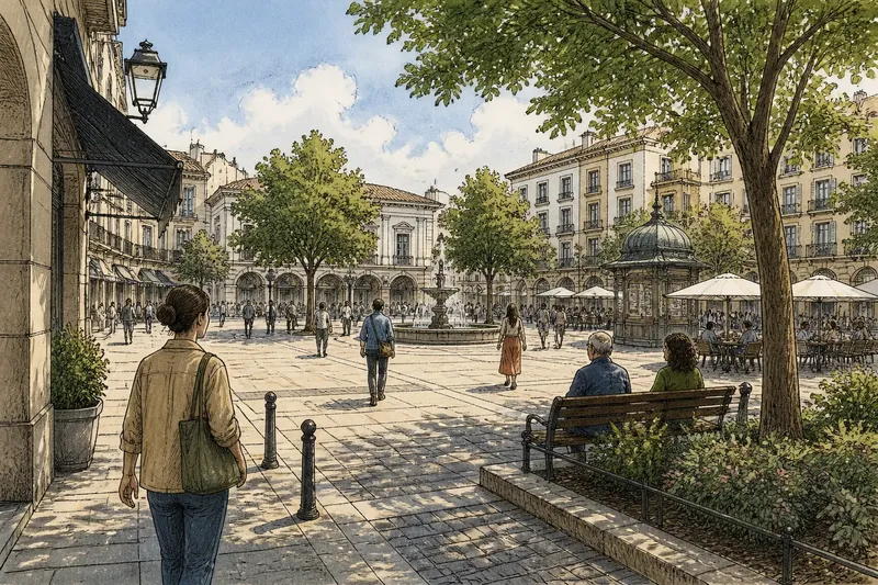
A public square feels different from a street because its edges gather people around a shared space instead of directing them along a route. To notice how enclosure, movement, and invitation shape that difference, begin at the edge and walk inward before deciding whether the square welcomes a pause or mainly carries people through.
Start at the edge and see what the square holds
Choose a public square you can enter freely, then approach it from a street rather than arriving at its center. Pause where the paving, curb, building line, or planting first makes the space seem distinct from the route beside it. You are looking for a boundary, not necessarily a wall.
Some squares have strong edges: continuous building fronts, arcades, trees, fences, or a low ledge that traces a recognizable shape. Others open onto several streets and are enclosed mostly by changes in paving or by the way storefronts and entrances face inward. Neither arrangement is automatically better. The question is whether you can sense where the square begins and what, if anything, its edges invite you to do.
Look up as well as down. Building heights, balconies, awnings, and tree canopies can make an open plaza feel like a room, while a broad gap between buildings may leave even a paved area feeling like a junction. The comparison is simple: a square can act like a shallow bowl, with edges that hold attention, or like a tabletop with its sides cut away. That everyday image helps distinguish enclosure from mere open ground.
Now turn slowly and note what the edges contain. A doorway, café window, library entrance, or row of benches gives a boundary a human scale; a blank wall or service entrance may make the same line feel closed. Record what you can observe without assuming why a feature was designed that way.
Follow the routes before choosing a place to stop
Walk across the square on the paths that seem most natural, including the line between its busiest entrances. Notice whether paving, desire paths, or clusters of people reveal a direct crossing. Then look for routes that curve around a fountain, planting bed, kiosk, or other feature. These lines show how the square handles movement without requiring a map.
A street usually presents movement as its main instruction: continue along it, cross at an opening, or turn at an intersection. A square can do more than one thing at once. It may have a quick diagonal route for people heading somewhere and slower paths that bring visitors past seating or the center. When those routes are legible, passing through and staying awhile can coexist.
Pay attention to where a route starts and ends. Does it connect two useful entrances, or does it deposit walkers at an awkward corner? Can someone cross without weaving through tables or cutting across a gathering? A square that supports passage tends to make its crossings clear; one that makes every route indirect may encourage lingering in some areas while frustrating people who need to get across.
Watch for a short time from a spot that does not block anyone. Notice whether people cut straight through, trace the edge, stop at a crossing, or change course around groups. These are observations, not a verdict on the place: a busy event, a delivery, or the weather can temporarily alter how people move.
Read seating and shade as invitations
Once you understand the routes, look for places where a person could pause without becoming an obstacle. Benches set back from the main crossing, broad steps beside an entrance, and low walls facing a busy part of the square can all offer a reason to stay. Compare those with seats placed in full view of fast foot traffic or with nowhere comfortable to sit beyond a café’s paid area.
Invitation is often a matter of orientation. A bench facing another bench makes conversation easier; one facing a fountain or a lively street suits watching. A seat tucked beneath a tree offers shade, while a sunny ledge may work better on a cool day. Ask what kind of pause each spot seems to support, rather than counting seats as if every one served the same purpose.
Also notice whether a person can arrive at a resting place without crossing a crowd or stepping over a planting edge. Smooth, connected paths make an invitation more usable for people with strollers, mobility aids, or tired legs. Where access is uncertain, describe the obstacle you see rather than guessing how every visitor experiences it.
Other cues matter: a drinking fountain, a visible public entrance, a sheltered corner, or a clear view of the square can make stopping feel easier. Conversely, loud traffic, wind funneled between buildings, or a lack of shade may make an apparently generous seating area less appealing. A square’s invitation is not just the presence of a bench; it is the whole approach to it.
Compare the center with the margins
Stand near the middle and look toward the edges, then walk the perimeter and look back. The center may be a stage for public activity, a crossing point, or an empty patch that people avoid. The margins may hold the most comfortable places to sit, watch, or meet. This change of viewpoint helps explain why a space that looks open from above can feel quite different at ground level.
Notice whether features give the center a purpose. A fountain, public art, shade tree, market canopy, or open patch of paving may draw people together, but its effect depends on nearby routes and places to pause. If people have to pass through the center to reach every exit, the space may feel exposed or hurried. If several clear paths run around a central feature, people can choose between crossing and stopping.
Look for small pockets formed by a change in paving, a planter, a colonnade, or the corner of a building. These can provide a sense of shelter without cutting the square into isolated compartments. A useful distinction is whether a feature makes a place more legible and comfortable or simply blocks the easiest way across.
Ask what makes this square welcoming or difficult?
Can a person cross the square without joining a crowd?
Look for a direct, continuous route between the entrances people actually use. If the shortest line is blocked by seating, outdoor tables, or a central feature, note the detour and whether another clear path serves the same purpose.
Where could someone pause without buying anything?
Check for public seating, steps that are clearly usable, shade, and open edges where a visitor can stand without obstructing movement. A square may look sociable yet offer few comfortable places to stay if all its chairs belong to a business.
Do the edges make the space feel held or shut off?
Notice whether entrances, windows, trees, and active ground-floor uses give the boundary signs of life. A strong edge can make a square feel sheltered, while an unbroken wall or barrier may make it hard to see where to enter or what lies beyond.
What changes when the square is busy?
Consider whether the walking route remains clear when people gather, sit, or queue. If a crowd would leave no comfortable route for passersby, the square may depend on quiet conditions to feel easy to use.
Use a simple example to put the vocabulary to work
Say you arrive at a paved square with four street entrances, a central planter, benches under trees, and a café occupying one corner. First, you trace the most direct route between the opposite entrances and find that it passes beside the planter rather than through the benches. Then you look for free places to stop and see that the shaded benches face both the center and the walking route.
That sequence gives you a grounded description: the square has several open approaches, a central feature that leaves a clear crossing, and shaded seating away from the main line of travel. You might also note that the café offers another kind of pause but is not the only one. Those details are more useful than calling the square simply lively or welcoming, because they explain which parts support passage and which invite lingering.
If the same square had a continuous fence around the planter, a narrow opening between tables, and no public seating, your description would change. You could say that movement is funneled through a particular gap and that opportunities to pause outside the café appear limited. Keep the wording tied to visible features; avoid turning one visit into a claim about how everyone uses the place.
Describe the experience without pretending it is fixed
Finish your walk by writing a few sentences that connect layout to experience. Name the boundary, describe the main route, and identify a specific invitation or obstacle. For example, you might mention a tree-lined edge, a straight crossing between entrances, and a ledge that lets people sit outside the flow. That compact account gives another reader something they can look for.
Separate what you saw from what you infer. “People crossed beside the fountain” is an observation; “the fountain makes people gather” is a possible interpretation that needs more than a passing glance. Note practical conditions such as a temporary event, a closed entrance, rain, or active construction if they shaped your visit.
Public squares can change character across the day and with different uses, so return at another ordinary time if you want a fuller impression. The same paving may serve a market, a shortcut, or a quiet meeting place depending on what is happening around it. For a first reading, though, the useful question is clear: does the square merely give movement room, or does its enclosure and arrangement also make a person feel invited to stay?
That distinction is the heart of why a public square feels different from a street. Follow its edges, trace its crossings, and look for places where stopping feels natural; you will have a precise vocabulary for describing what the layout makes possible without mistaking one moment for the whole life of the place.